The Evolution of Web Design: From Geocities to Gorgeous
Professionals stay on top of trends and best practices, and
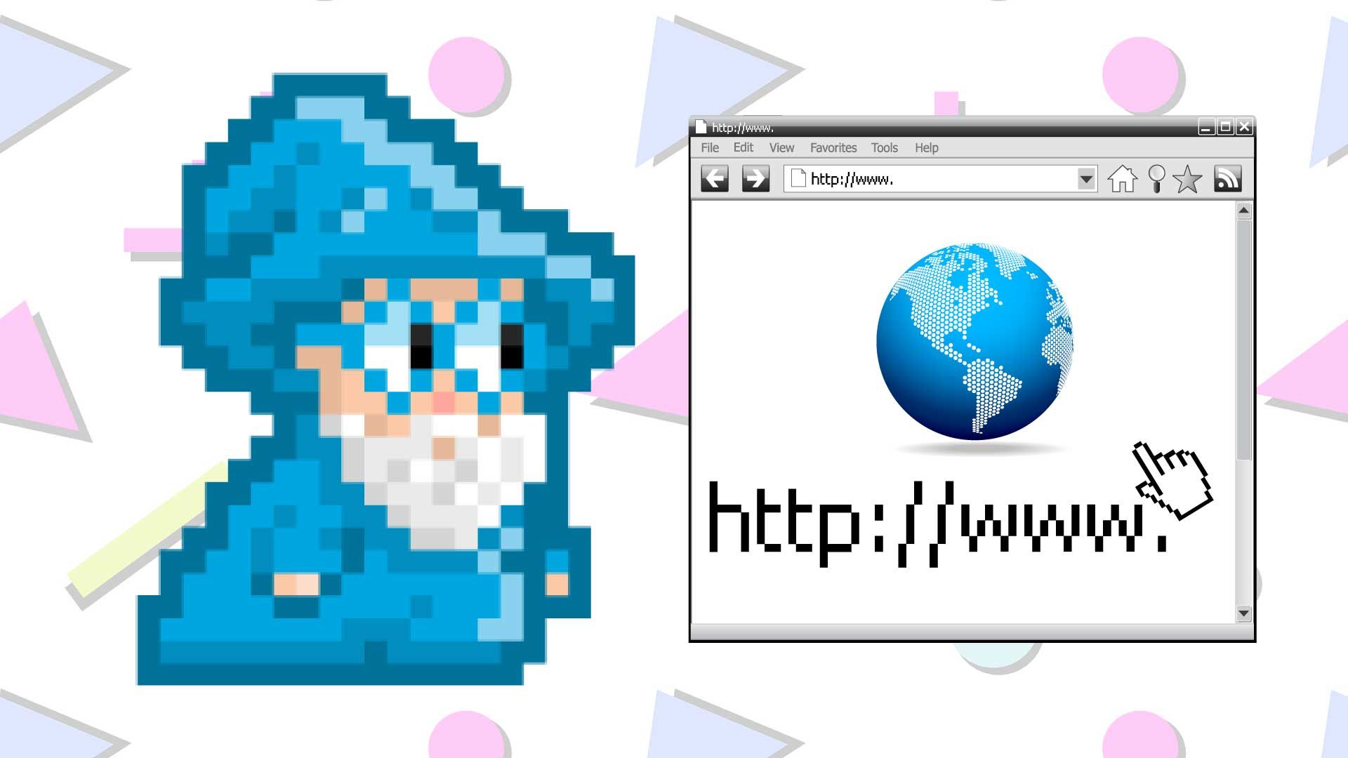
Design Wizards builds modernized website design into our packages! But what did websites look like back in the day? Web design has certainly come a long way since the early days of the internet. What started as a simple tool for sharing information has transformed into an art form and a powerful business asset. The journey from basic, text-heavy pages to sleek, interactive, and visually stunning websites mirrors the growth and sophistication of the internet itself. In this article, we’ll explore the evolution of web design, from the chaotic, pixelated pages of Geocities to today’s beautifully crafted digital experiences.
The Early Days: Geocities and Simple HTML
The internet in the early 1990s was a wild frontier. Geocities, launched in 1994, was one of the first platforms that allowed users to create their own websites without any coding knowledge. Websites were essentially digital scrapbooks—cluttered, with bright colors, heavy use of animated GIFs, and simple text links. Designers and users alike had limited tools, and creativity often took a backseat to functionality.
Websites in this era were built using basic HTML (Hypertext Markup Language), and the concept of "design" was often an afterthought. Pages loaded slowly due to limited bandwidth, and flashy designs were the norm—mainly because the internet was still a novelty, and most users hadn’t yet formed expectations about usability or design standards. Visitors were willing to overlook poor design in exchange for content, which at the time, was the true value of the internet.
The Rise of CSS and Early 2000s Designs
As the internet matured, web designers began to experiment with style. CSS (Cascading Style Sheets) emerged as a way to separate design elements from content, making websites more flexible and easier to manage. The early 2000s saw the first glimmers of modern web design—websites began to look cleaner, with better typography, layout control, and consistent color schemes. However, many sites were still static and simple, lacking the dynamic feel of today’s pages.
Websites during this period tended to have basic navigation bars, tiled backgrounds, and were often filled with text-heavy content. The rise of broadband internet meant that sites could load faster and could accommodate more images and multimedia. Though these sites were a step up from the chaotic pages of Geocities, they still had a long way to go in terms of design sophistication.
Flash and the Flashy 2000s
During the 2000s, Flash became a major tool for designers. Websites were transformed with rich animations, interactive elements, and multimedia content. For a while, Flash was the go-to technology for creating visually impressive and immersive web experiences. Web designers could use Flash to embed videos, animations, and even games into websites, taking web design to new heights.
However, while Flash was a powerful tool for creating eye-catching designs, it also had its limitations. Websites built entirely with Flash could be slow to load, not mobile-friendly, and often not accessible to search engines or users with limited internet speed. As technology advanced, the drawbacks of Flash became more apparent, and designers began looking for alternative ways to create interactive, multimedia experiences without relying on Flash.
The Shift to Responsive Design: Mobile-First and User Experience
The next major leap in web design came with the rise of smartphones and tablets. As mobile browsing began to eclipse desktop usage, web designers had to rethink their approach. In 2010, the term “responsive design” was coined by Ethan Marcotte, marking a shift in how websites were built. The idea behind responsive design was to create websites that would adapt to different screen sizes, from desktops to tablets to smartphones.
This shift revolutionized web design, as it required designers to rethink their layouts, fonts, and overall user experience (UX). No longer could a website be designed with just one screen size in mind—designers now had to ensure their creations looked and functioned well on a variety of devices. This ushered in a new era of simplicity and minimalism in design, with a focus on clean layouts, faster load times, and user-centric experiences.
In addition to mobile responsiveness, the importance of user experience (UX) became more apparent. Websites were no longer just about aesthetics—they had to be functional, intuitive, and easy to navigate. Designers and developers began working closely together to create websites that were visually appealing but also provided a seamless experience for the user.
The Rise of Flat Design and Minimalism
With the increased focus on mobile-first design, flat design became a major trend in the 2010s. Flat design is characterized by its use of simple, two-dimensional elements, such as solid colors, simple shapes, and minimal textures. It was a departure from the overly complicated, 3D design styles of the previous decade.
Flat design emphasized usability, with elements like buttons and icons designed to be intuitive and easy to understand. The minimalist approach, which focused on stripping away unnecessary elements and clutter, became the hallmark of modern web design. Websites became faster to load, easier to navigate, and more aesthetically pleasing.
This period also saw the rise of “Material Design,” introduced by Google in 2014. Material Design took flat design a step further by incorporating subtle shadows, animations, and depth to create a more dynamic user experience. The design principles were based on real-world materials and how they interact with light and shadow, giving websites a sense of realism and interactivity while maintaining a simple, clean aesthetic.
Today: Immersive and Interactive Experiences
As web design continues to evolve, the focus has shifted to creating immersive, interactive, and highly engaging websites. Today, websites are not just digital brochures—they are dynamic, interactive experiences. The combination of advanced CSS, JavaScript, and HTML5 allows designers to create websites with complex animations, scrolling effects, and seamless transitions. Parallax scrolling, infinite scrolling, and interactive infographics are just some of the techniques being used to create websites that capture users’ attention and keep them engaged.
In addition, personalized experiences have become a major trend. Websites can now dynamically adjust their content based on user behavior, preferences, and even location. This level of personalization creates more relevant and engaging experiences for visitors, making websites feel more like tailored experiences than generic webpages.
Conclusion
The evolution of web design from the chaotic pages of Geocities to the sleek, interactive websites of today reflects the growth and maturation of the internet. From basic HTML to dynamic, multimedia experiences, web design has continually adapted to changing technologies, user needs, and aesthetic preferences. As we look to the future, we can expect web design to become even more immersive, personalized, and innovative, continuing to push the boundaries of what’s possible in the digital realm.
For small businesses and entrepreneurs, this evolution presents exciting opportunities. With modern web design, you can now offer your customers a more engaging and personalized experience, helping your brand stand out in an increasingly competitive online landscape. So, whether you’re building a website from scratch or redesigning an existing one, remember that your website is more than just a digital presence—it’s a powerful tool that can shape the future of your business.
Contact us today and let Design Wizards modernize your website


★★★★★
Great to work with! Awesome experience! Highly recommended!
— Meri T
★★★★★
Knowledgeable, professional management and staff!
— Ben Ehrmantraut
★★★★★
The team at design wizards takes care of my website needs with ease. Very friendly and professional staff
— Mitch Lennick