The Power of Mobile Responsiveness: Creating Seamless Digital Experiences
So, why do mobile website experiences matter so much?
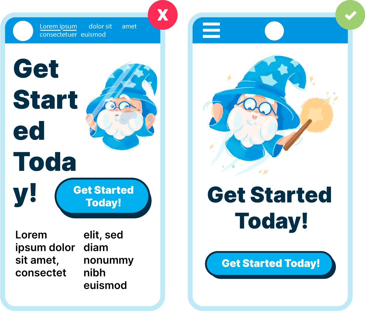
One of the most essential aspects of modern web design is mobile responsiveness—and today, we’re breaking down why it’s crucial for your business and how we ensure your site is designed to deliver a seamless user experience everywhere.
Accessibility Across All Devices
Imagine this: a potential customer lands on your website using their smartphone. If your site isn’t optimized for mobile, that first impression could be clunky and frustrating. But with mobile responsiveness in place, your site adjusts smoothly to any screen size—no awkward zooming or horizontal scrolling required. The result? Effortless access and navigation that welcomes visitors from the very first click.
A Key Driver of SEO Performance
Search engines like Google prioritize mobile-friendly websites in their rankings. That means mobile responsiveness isn’t just about appearance—it’s also a significant factor in your search visibility. By making sure your site adapts effectively to mobile devices, we help you climb the search results and get discovered by more of your ideal audience.
Enhancing the User Experience
A good user experience is foundational to a successful website. Mobile responsiveness ensures that your content, layout, and interactive elements function intuitively, no matter the device. At Design Wizards, we fine-tune every element—buttons, text, images, menus—to ensure your site feels smooth and polished whether someone’s visiting on a phone, tablet, or desktop.
Boosting Engagement and Retention
When users have a positive, uninterrupted experience on your website, they’re more likely to stay longer, explore more, and return again. Responsive design encourages meaningful interaction with your content, builds trust, and ultimately helps turn visitors into loyal customers. It’s a smart investment in long-term engagement.
Built to Adapt with the Times
Technology evolves quickly, and so do the devices people use to browse the web. A responsive website is built to adapt—not just today, but for the future. We design flexible layouts that handle new screen sizes and resolutions with ease, ensuring your site remains consistent and dependable even as trends change.
Our Commitment to Responsive Design
At Design Wizards, every website we build is thoughtfully crafted to work beautifully on every screen. Our team of designers and developers collaborate closely to create responsive experiences that look great and perform seamlessly—whether viewed on a smartphone, tablet, laptop, or desktop.
Let’s Optimize Your Website
Mobile responsiveness is no longer optional—it’s essential. It improves accessibility, enhances search rankings, strengthens user experience, and future-proofs your digital presence. Let us help you create a website that works effortlessly everywhere your audience goes.
Ready to upgrade your site with mobile responsiveness?
Contact Design Wizards today and let’s create a user experience your visitors will love—on every device.


★★★★★
Great to work with! Awesome experience! Highly recommended!
— Meri T
★★★★★
Knowledgeable, professional management and staff!
— Ben Ehrmantraut
★★★★★
The team at design wizards takes care of my website needs with ease. Very friendly and professional staff
— Mitch Lennick